05 mei, 2025
FluiKit - Flutter UI Kit
05 mei, 2025
FluiKit The Next Level in
Flutter App Development
A single Framework to support all six paltforms with a
Native Design
Native Design
Benefits Working with FluiKit
Why FluiKit is the best way to Kick Off your project.
-
Real Native Support for Six Platforms
While Flutter allows you to build apps for six platforms, that doesn’t mean everything works seamlessly out of the box. That’s where FluiKit comes in. FluiKit is designed to give each platform a native experience—while you only need to build one screen that works across all of them. -
Single Screen Build
With FluiKit, you only need to create a single screen layout, and it will automatically adapt to each platform's native environment. This approach saves you valuable development time while ensuring a consistent look and feel across all platforms. -
Responsive Layout
FluiKit is built to support responsive design on any screen size. This is handled directly in the code using built-in configuration settings and flexible layout structures. -
Reusable Widgets
FluiKit includes a rich set of reusable widgets suitable for various types of projects. Some widgets are part of the theme’s "Design Elements" to maintain a consistent style, while others are drag-and-drop ready for immediate use in your screens. -
App Settings File
In the main lib folder, you’ll find the AppSettings file. This is where you configure your project’s main settings—without modifying the FluiKit core files. It keeps the framework clean and maintainable. -
Router Navigation
FluiKit uses GoRouter for navigation. All platforms share a single router configuration, making it simple to add or remove menu items from your project. You can also set the screen transition type in the AppSettings file, with nine options available. -
App Menu Items
Manage all six platforms from a single file—easily add or remove menu items using the built-in MenuItem builder. -
Locale & Translation Support
FluiKit is ready for multi-language support. By default, it includes three languages, but you can easily add or remove any. If your app only needs one language, you can disable the translation feature entirely via the AppSettings file. -
Theme Mode Switch
Each platform includes a Theme Mode Switch—a handy tool during development and a nice feature for users. If you prefer to use it only during development, you can easily hide it by setting a flag in the AppSettings file.
AppSettings
Easily change settings without having to update the code on every platform.
-
App Name
Set your app’s name once, and it will automatically be reflected throughout the app. (Applies only to elements within the "FluiKit" folder.) -
Logo Setup
Define your app's logo and dark mode logo paths—these will be applied consistently across all supported platforms. -
Primary & Secondary Colors
Each project or client may have unique branding. In the AppSettings file, you can define two colors: primary and secondary. (Note: Only the primary color is used within FluiKit.) -
Show and Hide Settings
Easily toggle visibility of various app settings, such as the Language Switch, Theme Switch, and other platform-specific options. -
Screen Transitions
For platforms that support it, you can choose from nine different screen transitions for smoother navigation. -
About This App Dialog
Customize the "About This App" dialog with your app’s name, version number, and package name. -
Platform-Specific Settings
Some platforms require unique configurations, which you can manage directly within this file.
App Menu Items
Three files to manage your app’s navigation and styling.
-
App Menu Items
Define all your app’s menu items in a single file. Each platform will automatically display them in its native style. -
App Router
This file handles navigation, directing each menu item to the correct screen or route within your project. -
App Menu Settings
Customize the styling of your menu items—set the icon, text, and other visual details to match your app’s design.
Theme
Consistent Theming Across All Platforms
-
App Theme
Each platform has its own dedicated theme file that adheres to its native styling guidelines, ensuring a natural look and feel. -
App Typography
Typography is centralized in a single configuration file for all platforms. While each platform follows its native text styling, FluiKit unifies these styles so you can apply consistent text appearance using just one instruction. -
Design Elements
FluiKit includes customizable buttons, containers, and cards as ready-to-use components. It also provides spacing elements to ensure consistent layout and spacing throughout your entire app.
Plaforms Preview
-
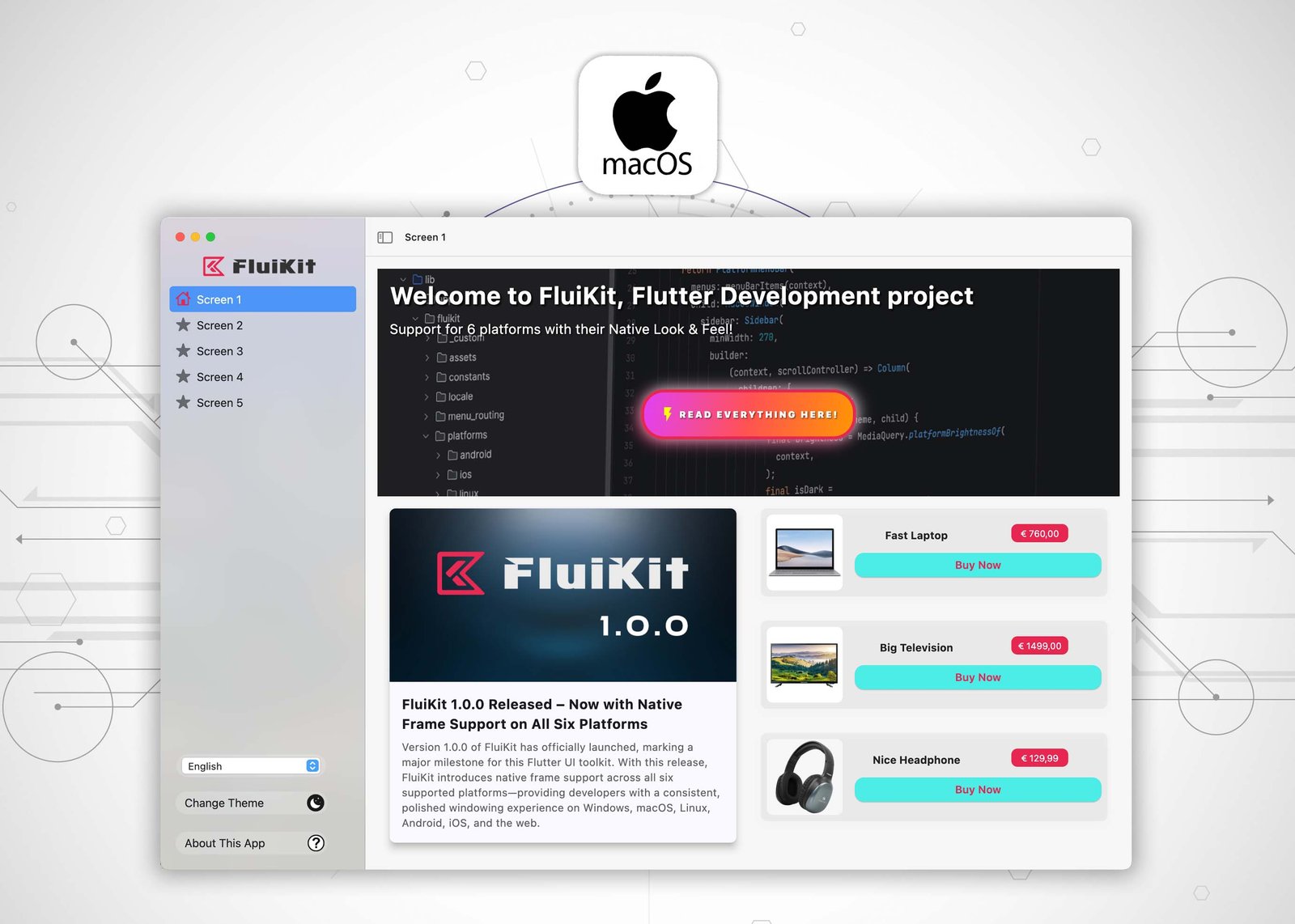
MacOS
-
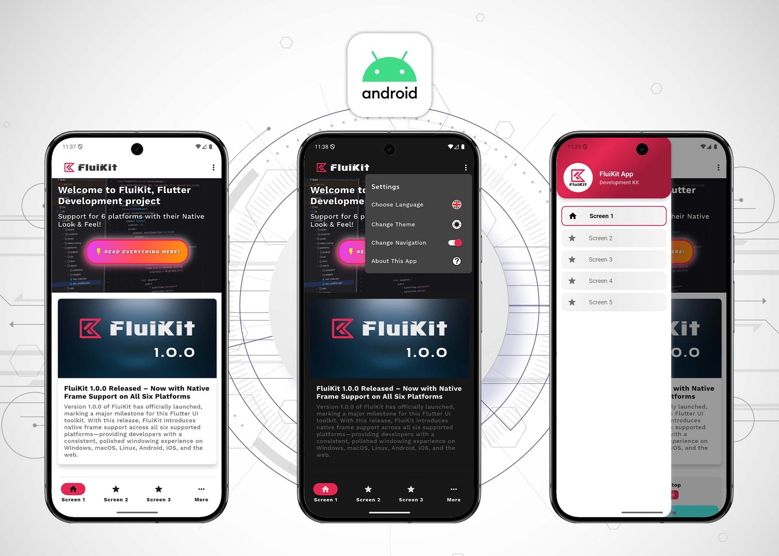
Android
-
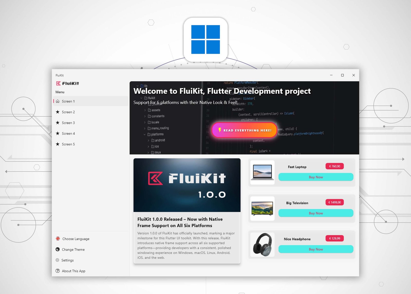
Windows
-
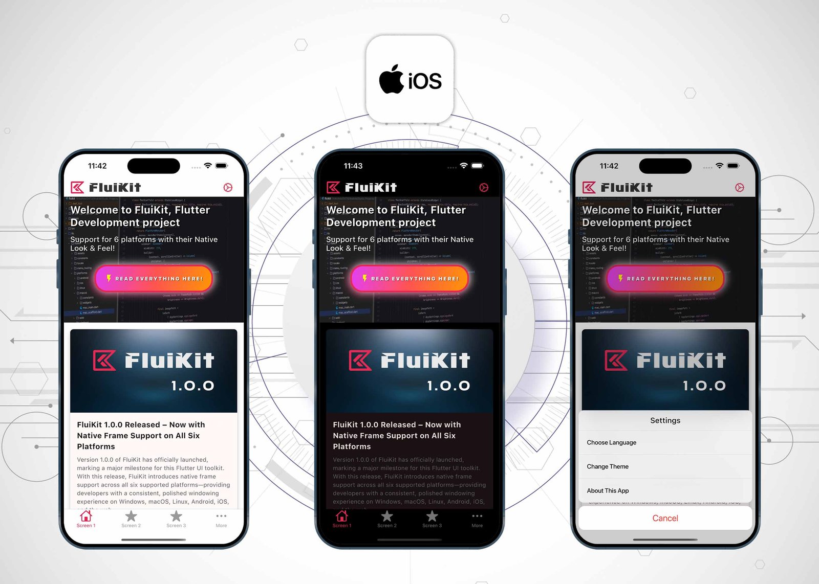
iOS
-
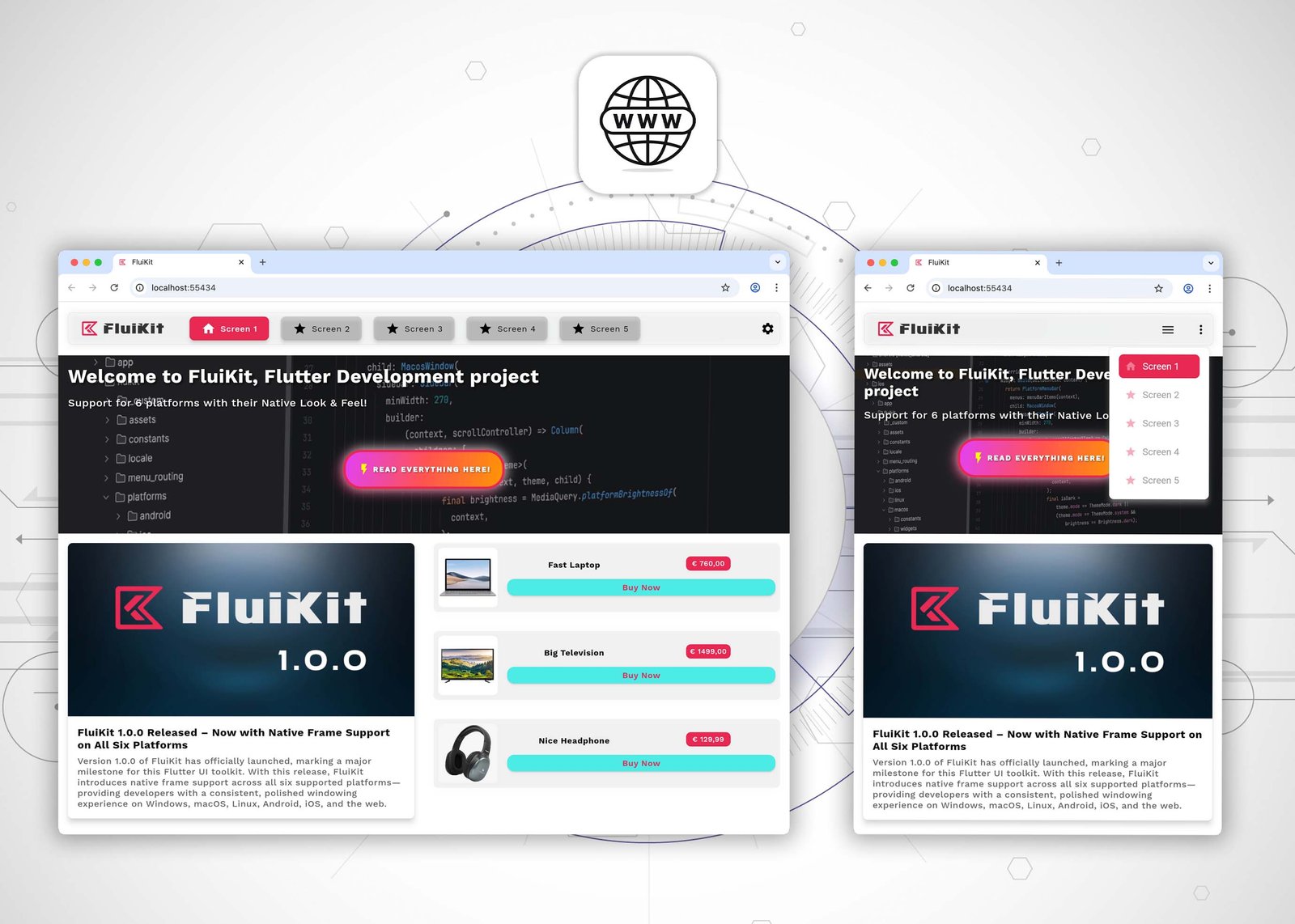
Web
-
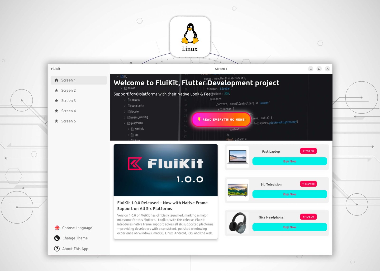
Linux
Android Studio / FluiKit File Structure
-

Android Studio File Structure
-

Android Studio File Structure
-
Flutter: 3.29.3
-
Dart: 3.7.2
-
DevTools 2.42.3
-
Kotlin: 2.0.20
-
Gradle: 8.10.0
-
Cocoapods: 1.16.2
Apps Build with FluiKit


Ready to Build with FluiKit?
FluiKit gives you the tools to create powerful, native-feeling apps for six platforms—all from a single codebase.
Does this sound like the toolkit you've been looking for?
Start your next project with FluiKit and experience the difference.
Danny van Dijk
